DenverStartupWeek.org

Assumption: DenverStartupWeek.org is not user friendly

Problem statement: Users need better navigation on DenverStartupWeek.org in order to increase attendance


standing-man-holding-a-book_318-62741
Who uses DenverStartupWeek.org?

  • Tech curious, early(ish) adopter
  • Reads Wired, NYT, keeps up on some tech theory
  • Not a browser; looking for something specific quickly
  • Job seeker or career climber
  • Uses tech/software/internet in daily work

Interviews:

Ramsay

  • Problem: navigation, finding specific courses, hard to/understand find tracks
  • Observed while watching use: a lot of scrolling, “where did that drop down come from”
  • Possible solution: key on same page

Jessie

  • Used to apply for sponsorship, couldn’t check status of application
  • Site didn’t recognize her (no history)
  • “Nearly impossible to find anything” 

2016 website (UX/UI Design by Guiceworks):

screenshot-2016-09-22-at-7-21-17-am screenshot-2016-09-22-at-7-21-35-am menu

Lo-fi Prototypes:

Airline customer service experience

Client: Hypothetical
Student exercise at General Assembly User Experience Design Bootcamp (October 2016)
Teacher: Amara Hulslander, Amazon.com

Users: Frequent travelers
Persona: “Frequent but harried traveler”
Travels 6-12 times per year divided between business and personal reasons 25-35 years old
Lives in or near city
Employed FT
Has had bad customer service interaction(s)
May have rewards program through work
Lacks time – expects to find information fast
Wants to control own schedule

Interviews:

Mike

  • Most recent flight (DIA to Seattle via Delta): Good experience because of minimal interaction with airline
  • Avoided customer service
  • Checked in online
  • Most recent bad flight experience (DIA to Nicaragua via United): Flight canceled
  • Waited in line at customer service desk, received no explanation
  • Could not get through to customer service phone line

Andrea

  • Most recent flight (DIA to Arkansas via United): Chose airline because of points program through work
  • Made reservation on website in order to better compare flights/price
  • But used app at airport after checking in
  • Frustrated by having to use multiple tools to accomplish one task

Problem statement: Regular traveler needs a way to interact with customer service with minimal frustration because s/he is currently avoiding customer service interaction.

Assumption: Lack of communication prevents Regular Traveler from becoming a loyal, repeat airline customer.
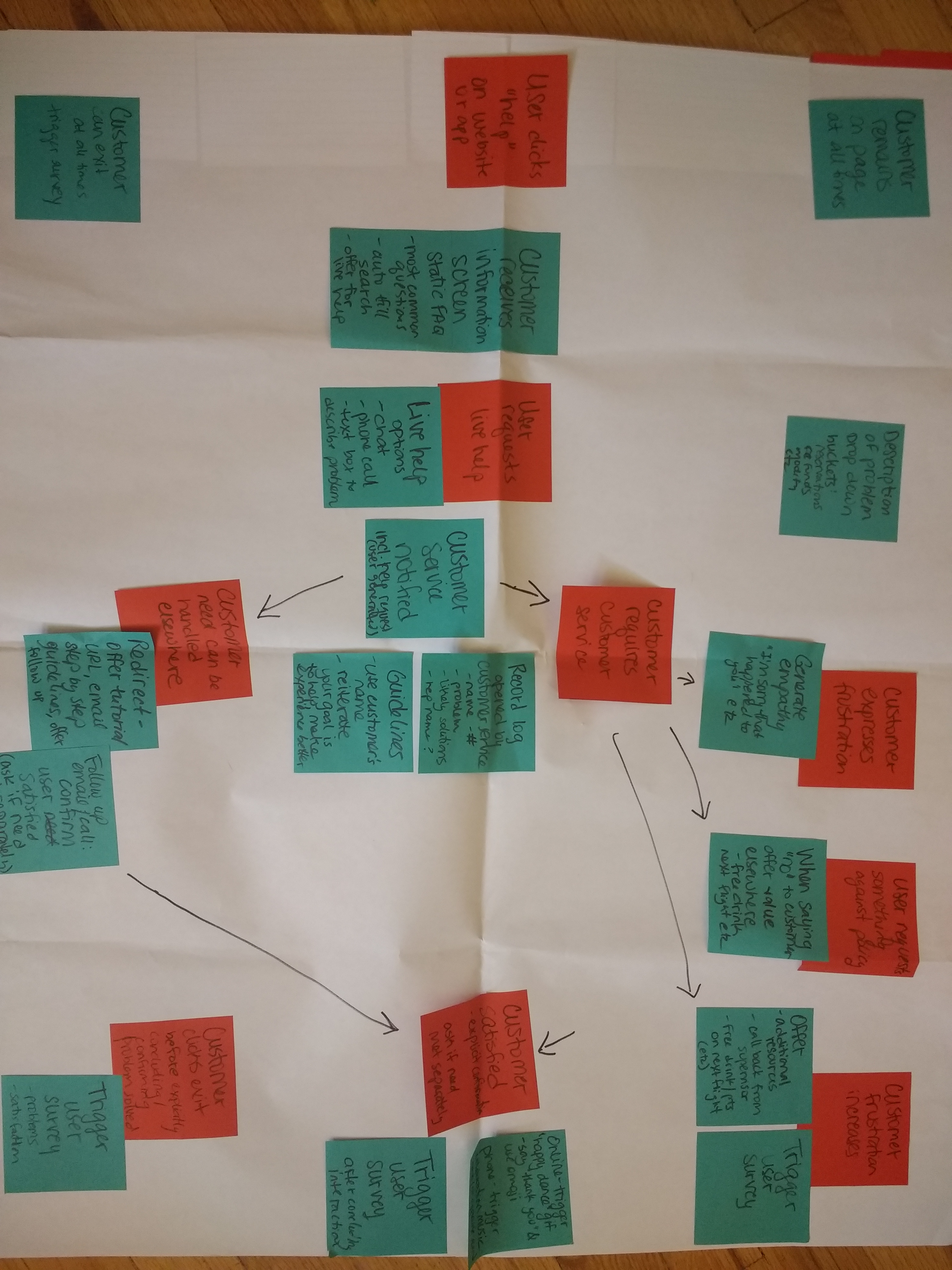
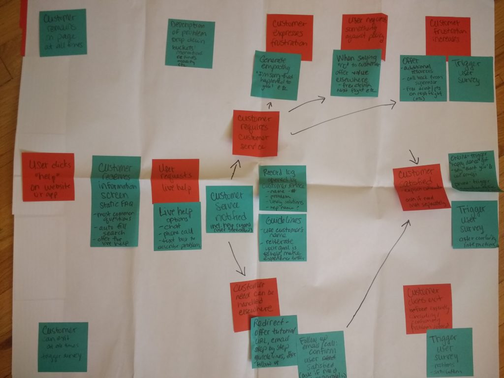
Flow chart:

img_20161009_111619768

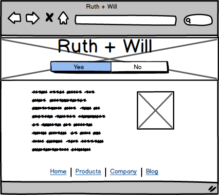
Original wireframes (used Marvel App):
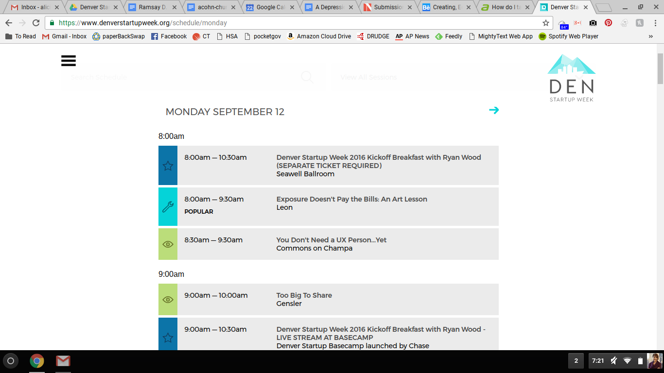
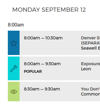
Moonmari.com

Client: Ruth Moon (the bride)
Provided content, design notes

Users: Primarily invited wedding guests
URL included on wedding invitations

Problem: Users need an easy way to RSVP so that they will do so ASAP.

Original wireframes (using Balsamiq and Marvel):

moonmari-homepagemoonmari-mobile


Client feedback: Different fonts, images, one information page

Final features: 3 pages total; countdown clock (JavaScript snippet); embedded Google map; links to registries, transportation and hotel information; RSVP form using Mailchimp; personalized Favicon; fully responsive

Capture
Capture1a
Capture1b