
Assumption: DenverStartupWeek.org is not user friendly
Problem statement: Users need better navigation on DenverStartupWeek.org in order to increase attendance
 Who uses DenverStartupWeek.org?
- Tech curious, early(ish) adopter
- Reads Wired, NYT, keeps up on some tech theory
- Not a browser; looking for something specific quickly
- Job seeker or career climber
- Uses tech/software/internet in daily work
Interviews:
Ramsay
|
Jessie
|
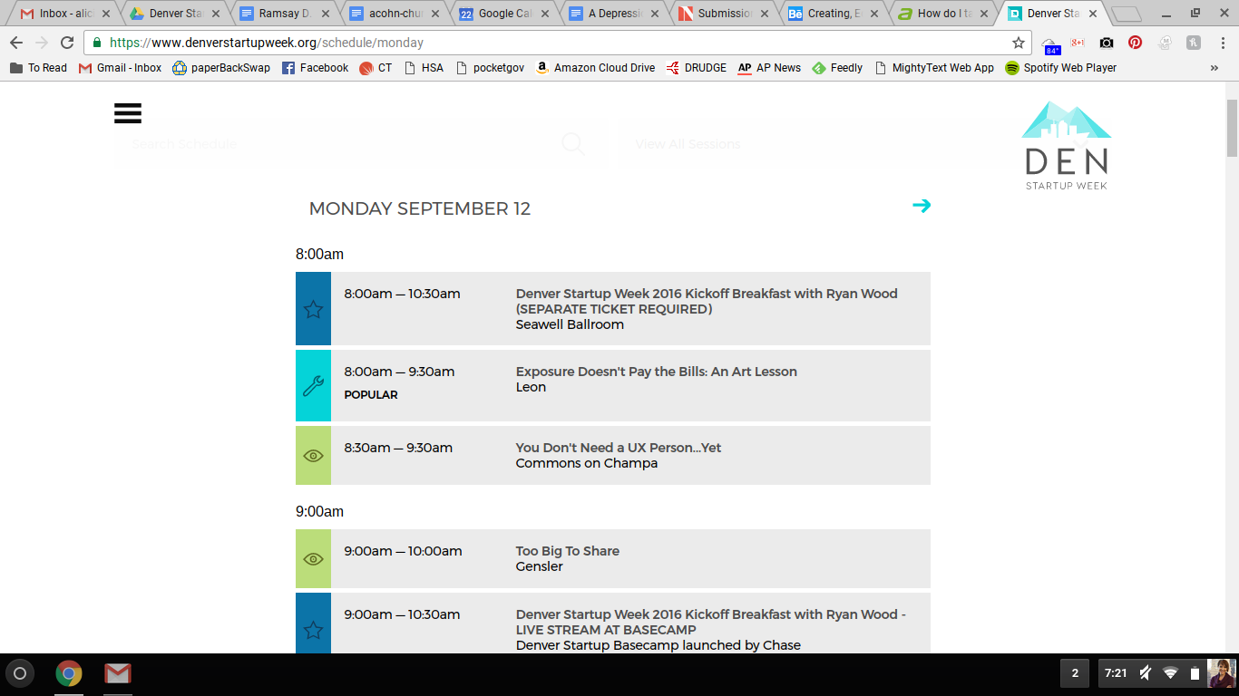
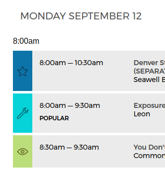
2016 website (UX/UI Design by Guiceworks):
 |
 |
 |